Mirror Case Study
Mirror is a clothing store chain founded in 1994 aiming for low-cost clothing for any occasion. Their motto is “any type of clothing accessible for everyone”. They have a budget-minded audience. Mirror currently has over 400 stores in 32 countries.
Project: MIRROR is a responsive web design project for a clothing store chain aimed at entering the e-commerce market. The goal was to create a seamless online shopping experience, from browsing to checkout, along with a new brand logo and style.
Problem: The primary challenge was to build a responsive website for MIRROR that enhances user experience, helps users find affordable fashion quickly, and drives e-commerce growth.
Duration: 3 months
Role: End-to-end UX/UI designer
Tools: Figma, Adobe Illustrator, Maze, Miro, Canva, Google Forms, Google Slides

RESEARCH
We conducted 1-on-1 interviews, surveys, and secondary research to understand the goals and pain points of MIRROR’s target audience. Competitive analyses highlighted gaps in the market, such as product recommendations and ease of navigation.
To capture authentic user perspectives, we conducted 1-on-1 interviews with three participants. The interviews explored demographic details and delved into their shopping habits. Key questions included their preference between in-store and online shopping and the frequency of their online shopping. the likes and dislikes about the experience, and the factors they prioritize when making online purchases.
1-on-1 interviews insights
To gather quantitative data on customer habits and shopping behaviors, we conducted a survey with 34 participants. The participants were recruited through family and friends, offering a broader view of shopping preferences and patterns.
CARES
Wide range of categories
Find in-store option
Styling recommendations
Overwhelming UX design of the shipping page
Not efficient product zoom-ins
Long sub-category list
survey insights
cares
Reviews & Comparisons
Delivery to door
Deals & More options
loves
Fast shipment & Easy returns
Trustability & Wide product range
Affordable but quality products
LOVES
PAINS
SECONDARY RESEARCH INSIGHTS
To gain a deeper understanding of the current market landscape, we conducted secondary research, analyzing existing trends, competitors, and consumer behavior.
Globally, more than $1 in every $5 was spent online.
In 2021, retail e-commerce sales amounted to $4.9 trillion U.S. dollars worldwide.
Apparel, accessories, and footwear are the number 1 e-commerce sector in the world.
%65 of shoppers put “wrong fit” as the number 1 reason for returning a purchase.
%39 of the shoppers return items if they feel the description didn’t match the actual product.
%43 of millennials and %46 of Gen Z buy with the intent to return products.
COMPETITIVE ANALYSES INSIGHTS
To gain a comprehensive perspective on the competitive landscape, we conducted a detailed competitive analysis focusing on H&M, Forever 21, and Uniqlo.
STRENGTHS
WEAKNESS
STRENGTHS
Wide range of categories
Style recommendations
Big search bar
WEAKNESS
Crowded product information
Not efficient product zoom-ins
Lack of white space usage
GOALS
Catching deals
Finding a wide range of products
Saving time
STRENGTHS
Product videos
Back-in-stock notification
Easy to navigate
WEAKNESS
Not enough category
Lack of white space usage
No product zoom-ins
RESEARCH FINDINGS
The research uncovered key user goals and pain points, which served as the foundation for structuring the UX design process for MIRROR.
PAINS
Poor product quality
Trustability
Receiving the wrong product
pains
Trustability
Receiving wrong products
Poor quality

INFORMATION ARCHITECTURE
Ashley Timesaver is a fast-paced young professional who needs affordable, stylish clothing options that save her time. Her main frustrations include unreliable online shops and poor-quality products.
"I always plan what to wear for the week so I don't rush myself in the morning."
PERSONA
card sorting
Ashley is in her late 20s and works as an Executive Assistant at a household appliances company. Her day is fast-paced as she manages the busy schedule of the Sales & Marketing Director. To unwind, Ashley seeks quiet time after work, often through yoga at CorePower Yoga, which is conveniently located just a few blocks from her office. When she's not in the mood for a class, she heads home, orders dinner, opens a bottle of cabernet, and binge-watches her favorite TV series on Netflix. She enjoys watching what's "Trending Now," but doesn't mind rewatching her favorites if nothing new catches her eye.
cares/loves
Create professional looks with affordable prices
Saving time
Finding a wide range of options
fears / frustrates
Poor-quality products, don’t last long
Lots of online shops hard to trust
Receiving products do not match with the photos.
To inform the navigation of the site, a card-sorting exercise was conducted using three participants. Each participant was given a list of clothing items and asked to group them in a way that felt most intuitive. Once they had created their groups, they were tasked with naming each category based on their understanding of the content.
PARTICIPANT 1
Sorted as outfits like where to wear. It took her the longest time since she was trying to create outfits.
Movie/Concert/Game
Formal Event
Hangout with Friends
Walking in the park
Cocktail
PARTICIPANT 2
sorted as categories. some of them look like sub-categories like socks, and sunglasses are not in the accessories categories. took him the shortest.
Accessories
Cardigans
Cargo
Jeans
Rompers
Shirts
Shoes
Socks
Suits
Sunglasses
Sweats
T-shirts
PARTICIPANT 3
sorted as categories and also seasonal. he also has some groups that look like sub-categories. he also took some time to sort.
Beach/Vacation
Bow tie/ties
Cardigan
Cargo
Jackets
Jeans
Men t-shirts
Rompers
Socks
Sparkle
Suits
Tennis shoes
Vests
Weird shirts
sitemap
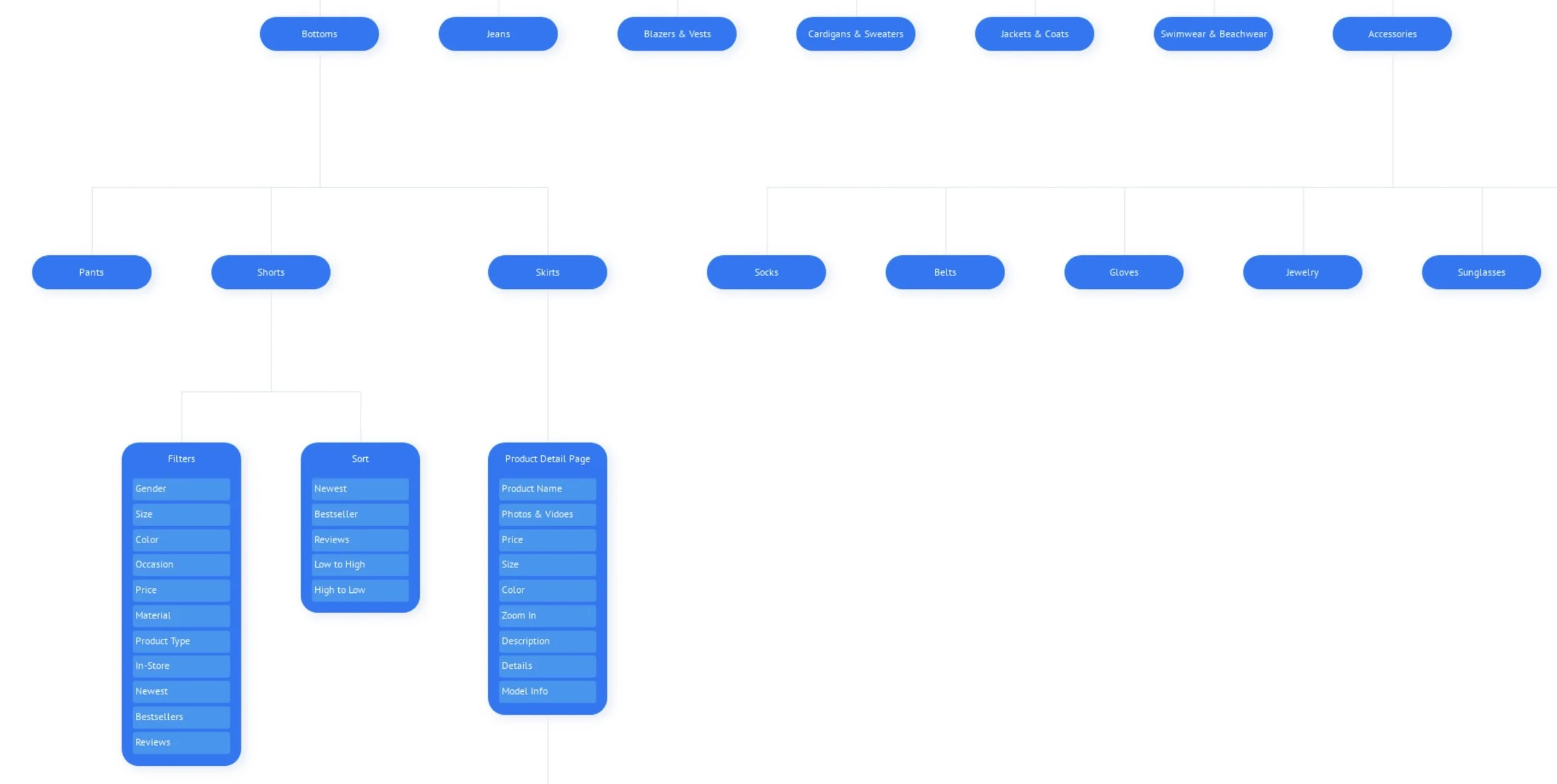
After collecting insights from the competitive analysis and card sorting exercises, the next step was to define how the information would be structured on the website. This process involved organizing the content in a logical, user-friendly way to enhance navigation and ensure a seamless user experience.
Please use the link to see the full sitemap for Mirror. https://drive.google.com/file/d/1C-knKEnHhXNGRfWXDqzJZ7F0a_VT4rsd/viewsketches
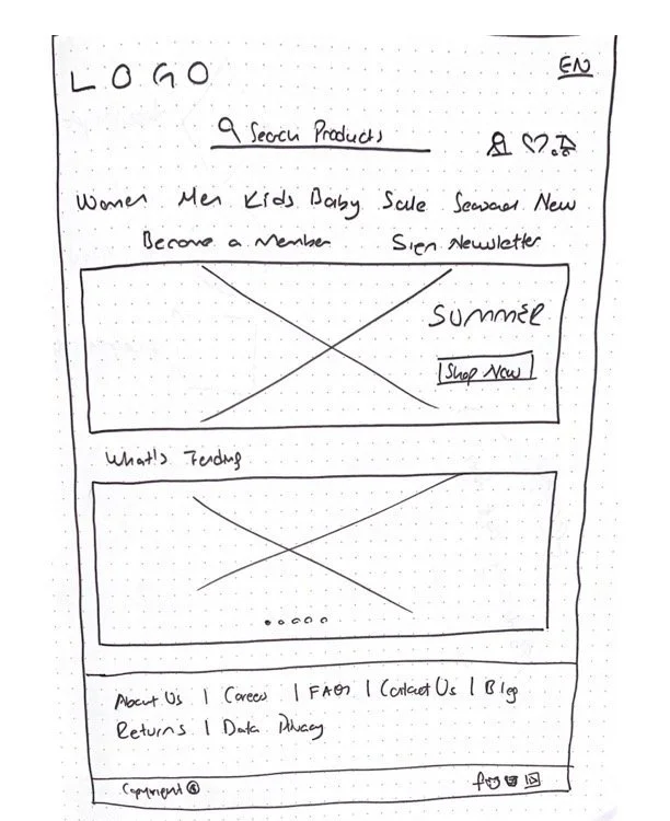
Early concept sketches for the MIRROR landing page were created to explore layout ideas and visual direction, laying the foundation for the final design.

INTERACTION DESIGN
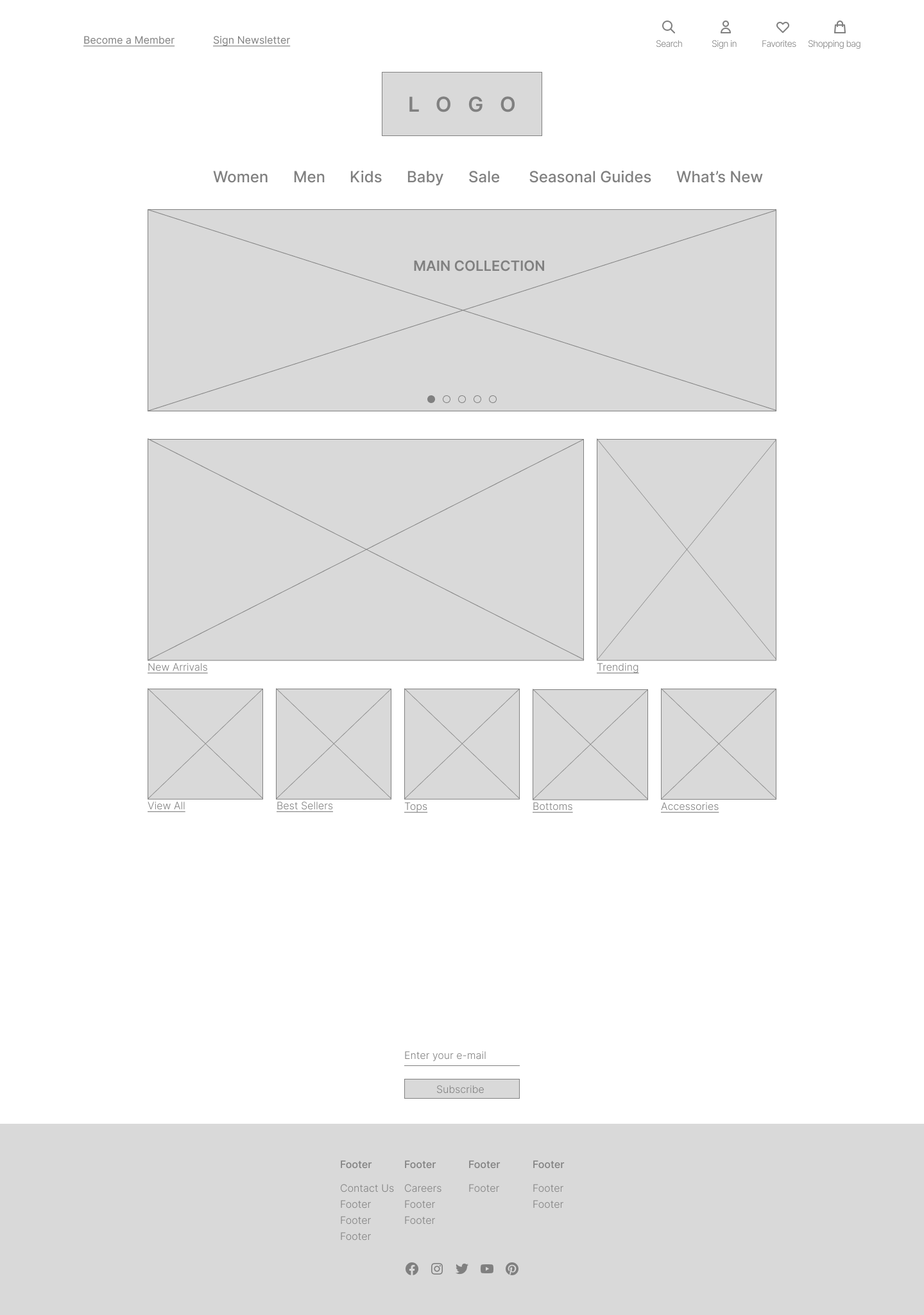
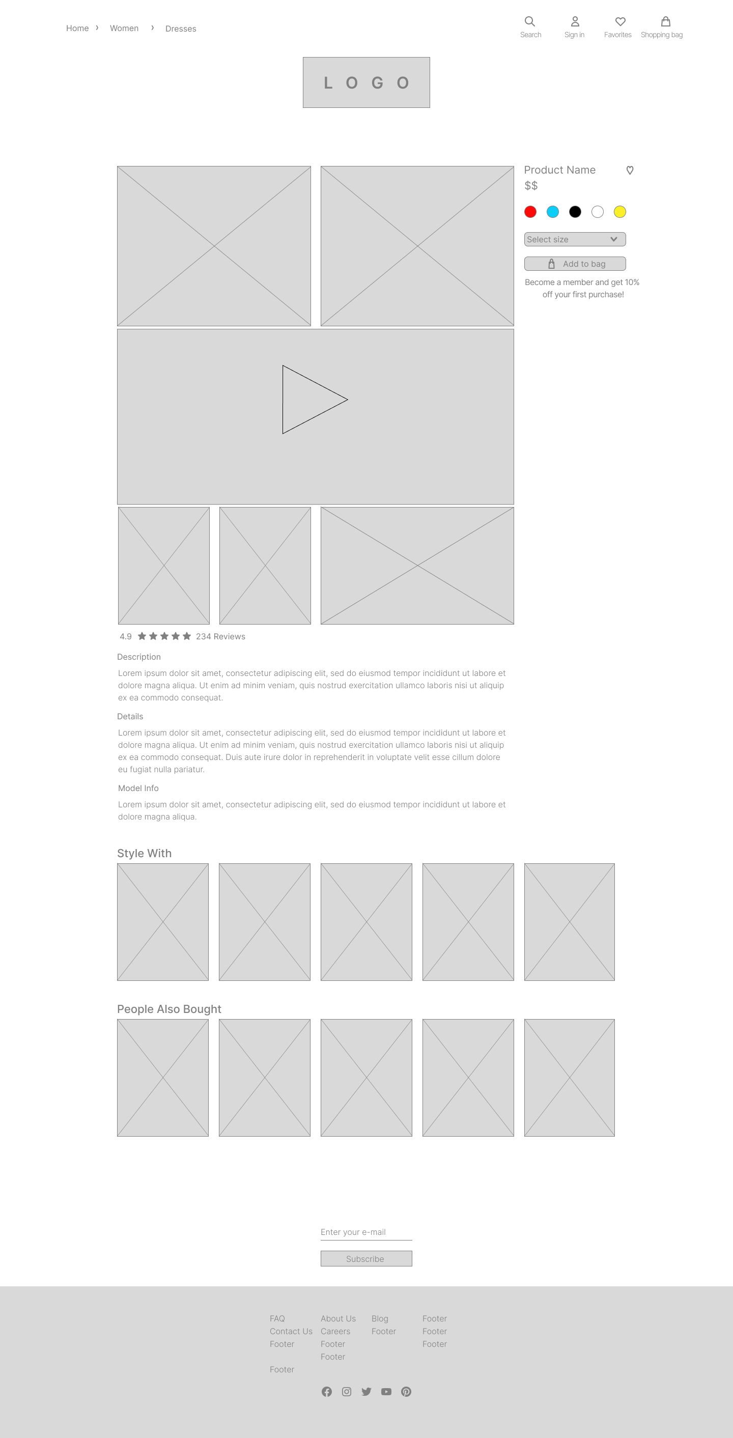
Starting with low-fidelity wireframes, we sketched out key screens, such as the landing page and product detail page.
TASK FLOW
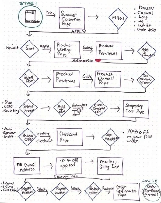
Ashley Timesaver sees an ad for Mirror’s Summer Collection on Instagram. Intrigued, she clicks the ad, which directs her to Mirror’s homepage. From there, she browses the Summer Collection and successfully completes a purchase.
USER FLOWS
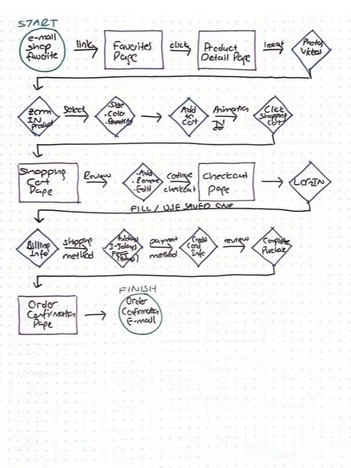
Three sets of user flows illustrate the different ways Ashley Timesaver could complete the task of purchasing an item: by clicking on an Instagram ad for the Summer Collection, through a 'Shop Your Favorites' email, or by googling and navigating to Mirror’s website.
WIREFRAMES
The initial landing page sketches, along with insights from the task and user flows, were transformed into mid-fidelity wireframes to establish the layout and functionality of the site.
HOME PAGE V1
HOME PAGE V2
PRODUCT DETAIL PAGE
RESPONSIVE WIREFRAMES
Two different layouts were designed for the Mirror homepage, optimized for tablet, and mobile devices to ensure a seamless user experience across all platforms.
RESPONSIVE LO-FI WIREFRAME / TABLET
RESPONSIVE LO-FI WIREFRAME / MOBILE

UI DESIGN
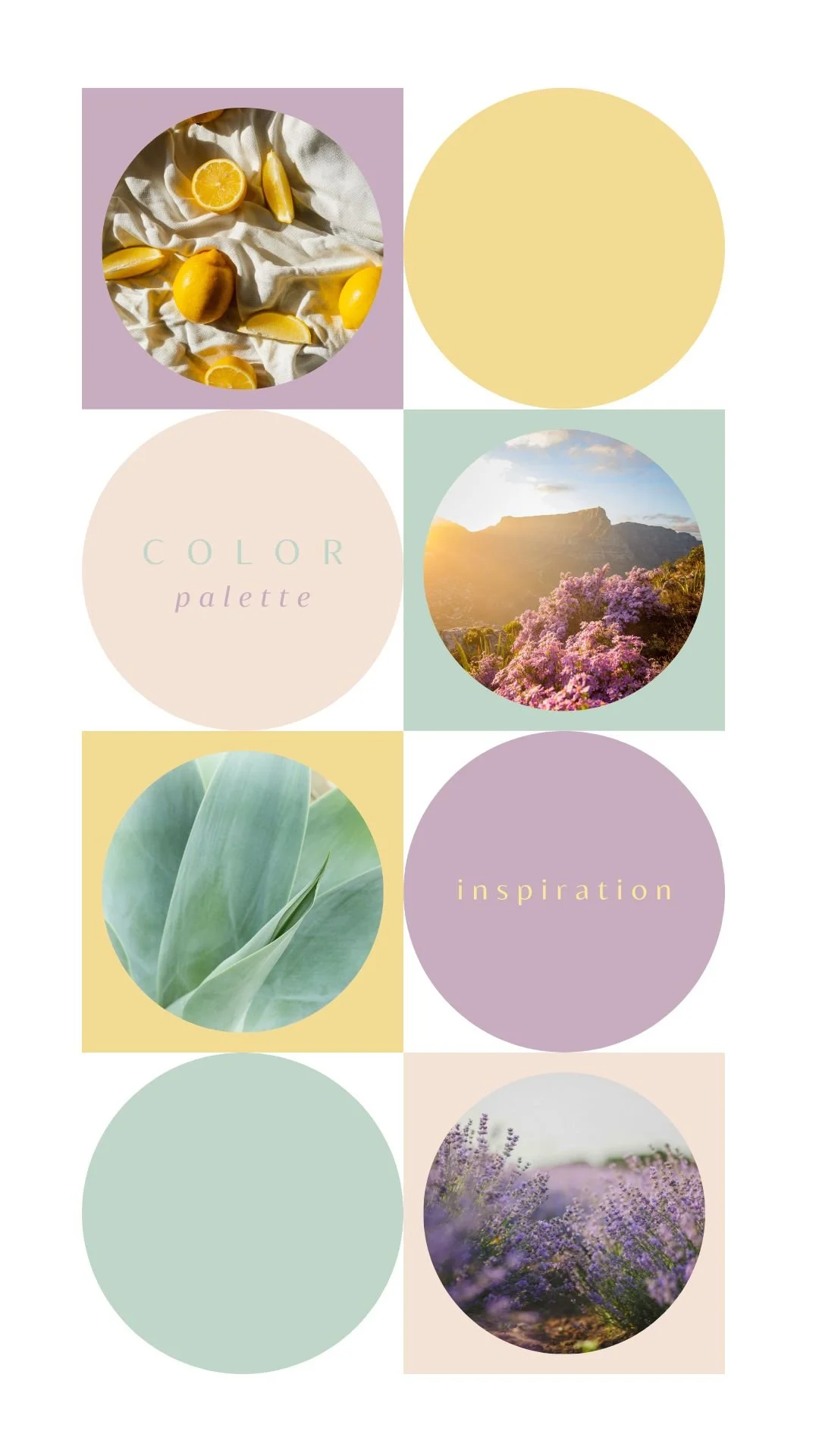
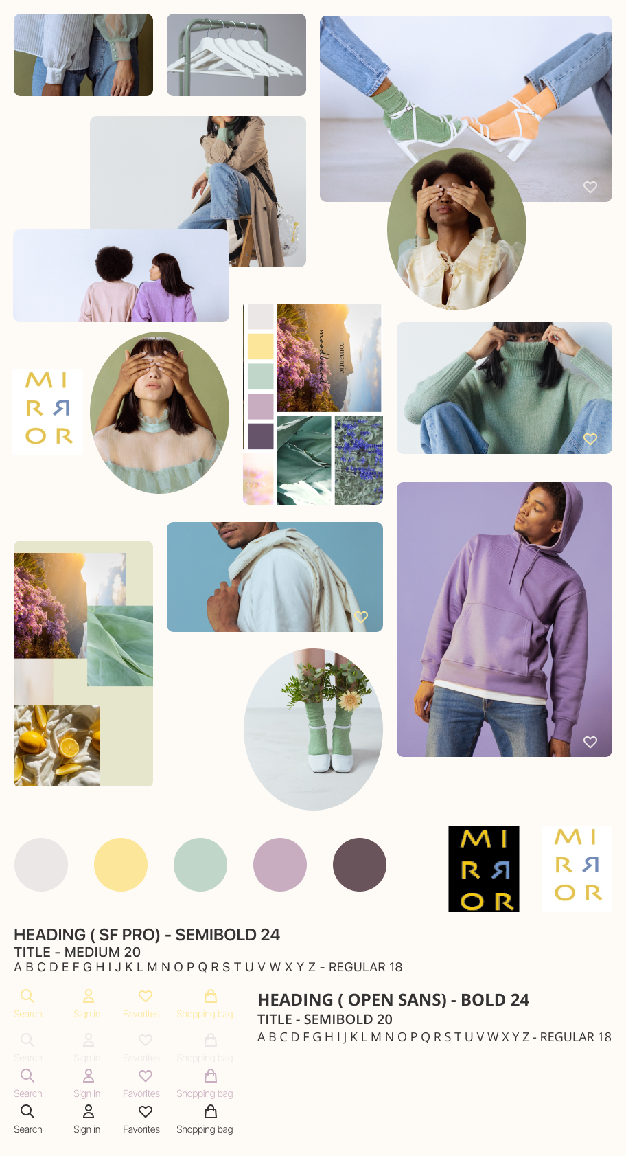
The UI design focused on soft, minimalistic aesthetics to align with MIRROR’s brand values. The color palette and iconography were carefully chosen to create a clean, stylish look.
MOOD BOARD
The inspiration for Mirror’s mood board was drawn from the calming and elegant aesthetic of lavender farms. The goal was to incorporate seasonal inspiration while staying true to Mirror’s core values of accessibility, affordability, and style.
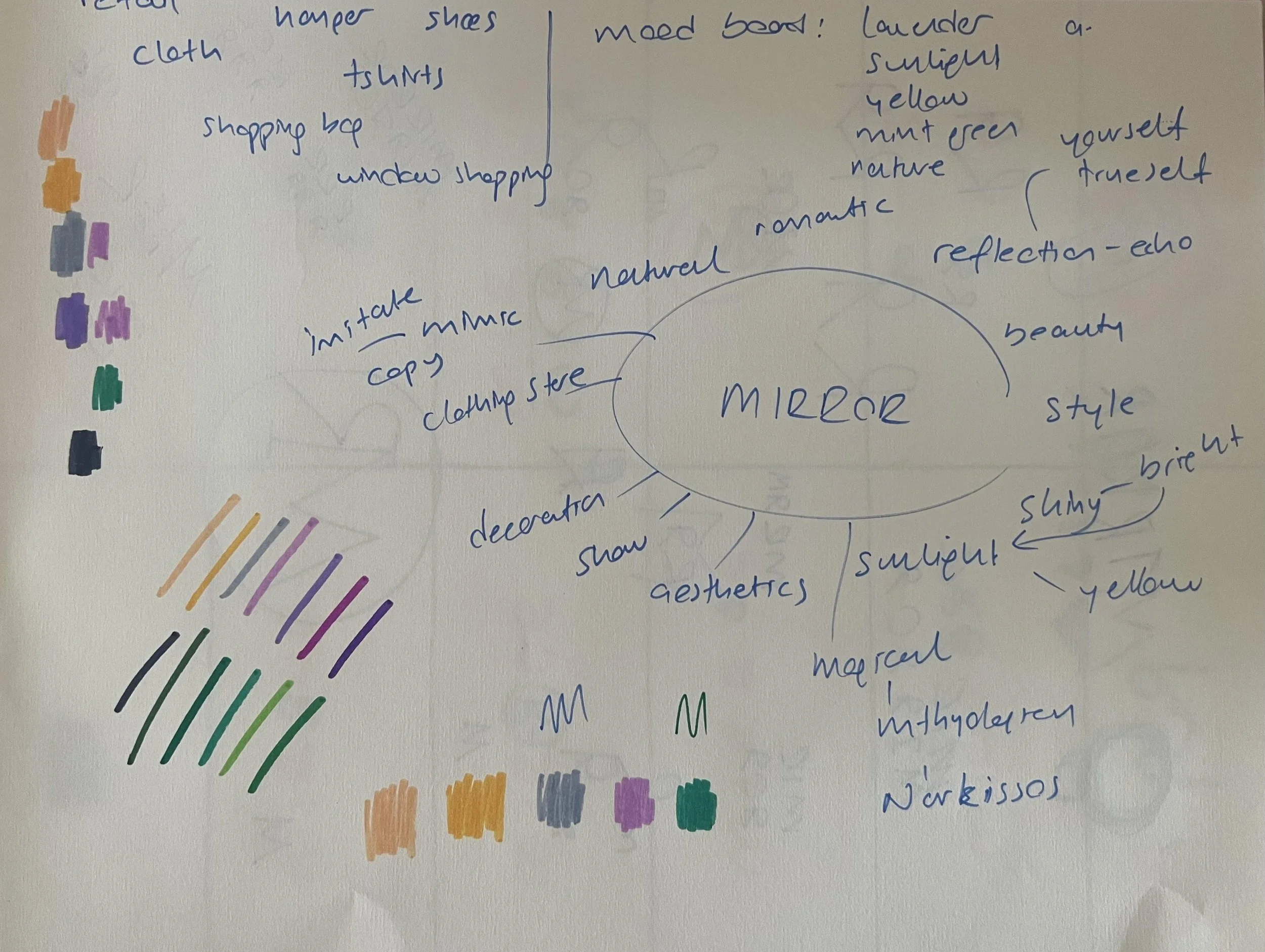
lOGO
The brainstorming process for the Mirror logo began with concepts of beauty, reflection, and self-perception. We explored various directions, but the idea evolved when we connected it to the mythological story of Narcissus, who became a flower after obsessively gazing at his reflection. This story inspired the final design, where the Narcissus flower replaces the "O" in the word "MIRROR," symbolizing self-reflection and transformation. The result is a logo that combines mythology and modern symbolism, encapsulating the brand's themes of self-awareness and personal growth.
BRAINSTORM FOR LOGO
LOGO DESIGN V1
FINAL LOGO DESIGN
BRAND STYLE TILE
A curated collection of Mirror's mood boards, logo designs, color palettes, icon sets, fonts, and imagery, providing a cohesive visual direction for the website's design.
RESPONSIVE UI DESIGN
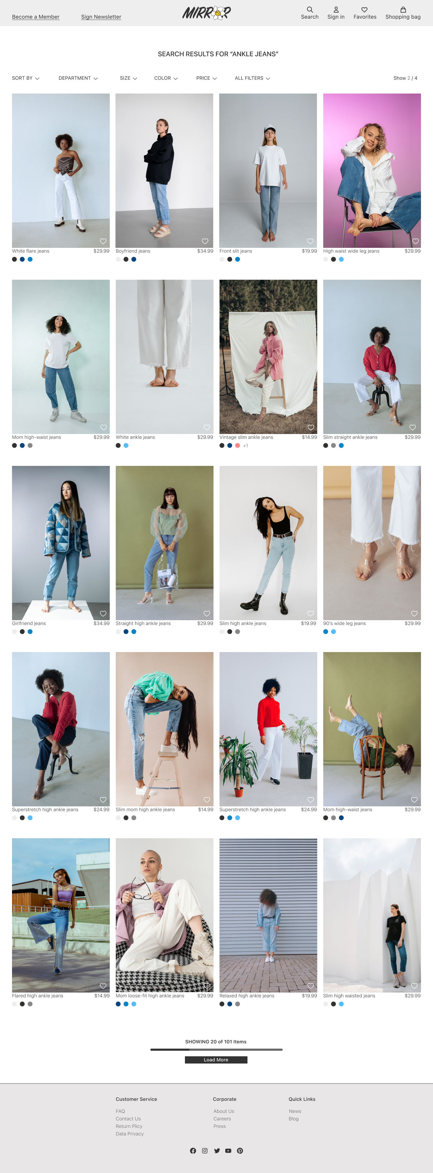
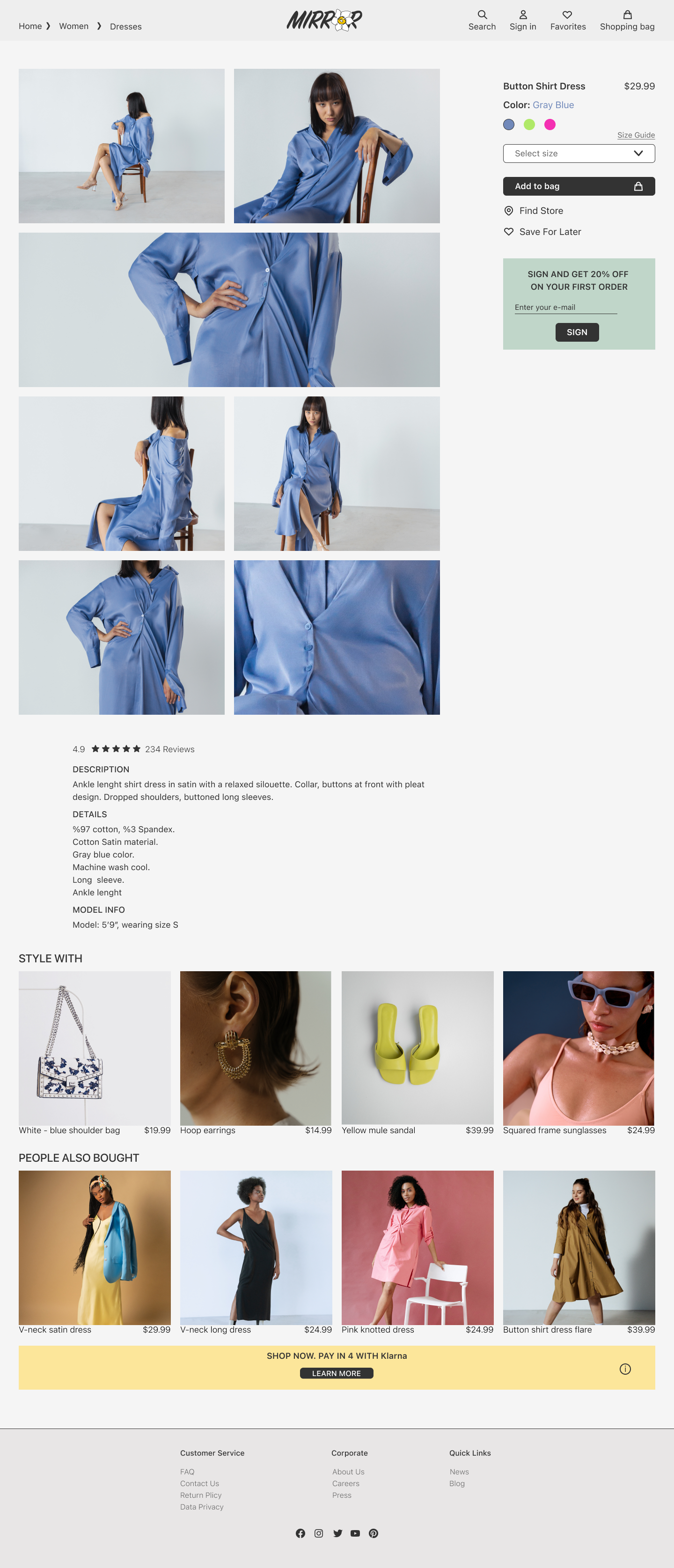
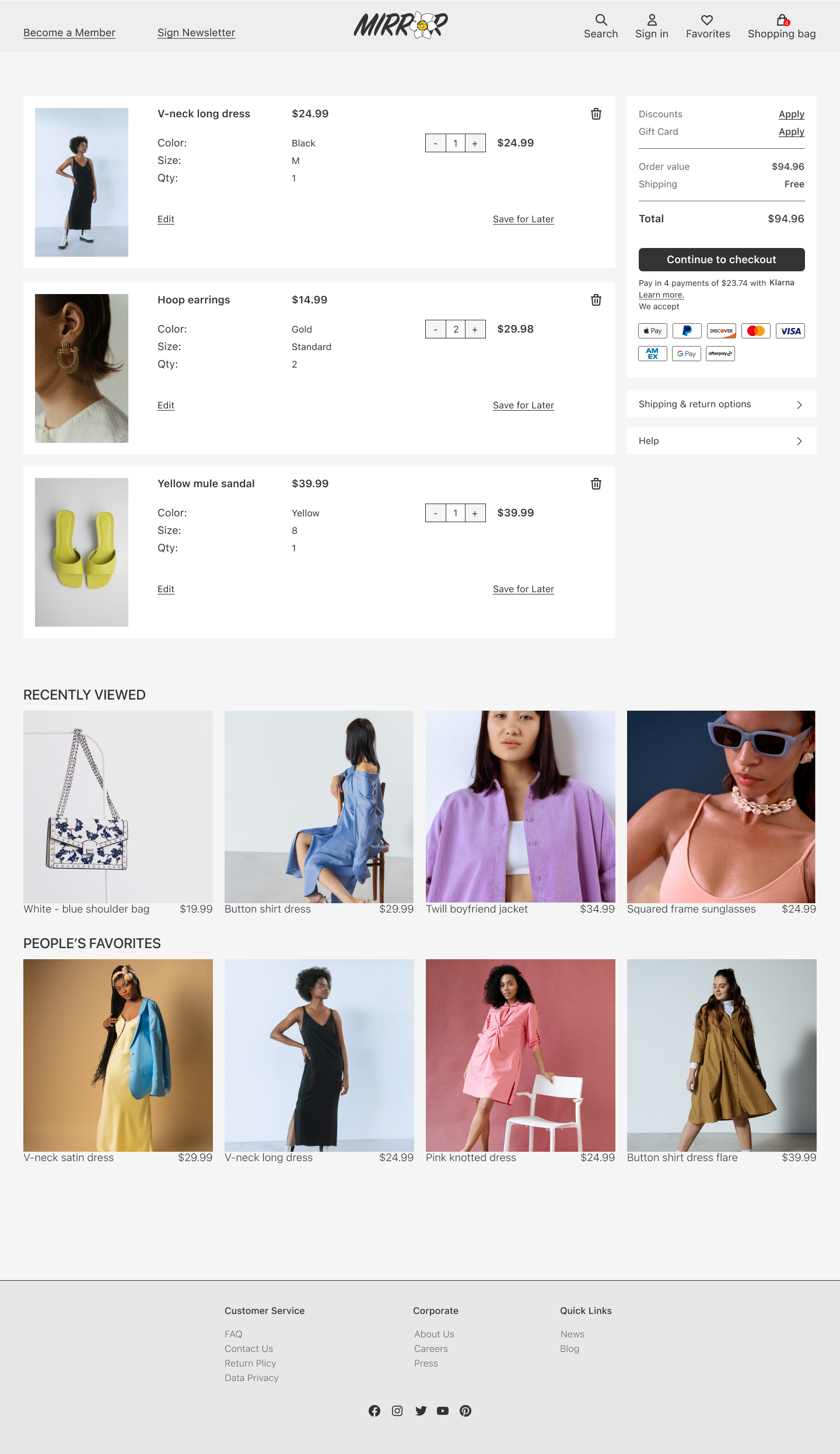
High-fidelity responsive UI designs were created for web and tablet versions of the homepage, search results page, product detail page, and checkout screen, ensuring a consistent and polished experience across devices.
HOME PAGE / DESKTOP
SEARCH RESULTS / DESKTOP
HOME PAGE / TABLET
PRODUCT DETAIL / DESKTOP
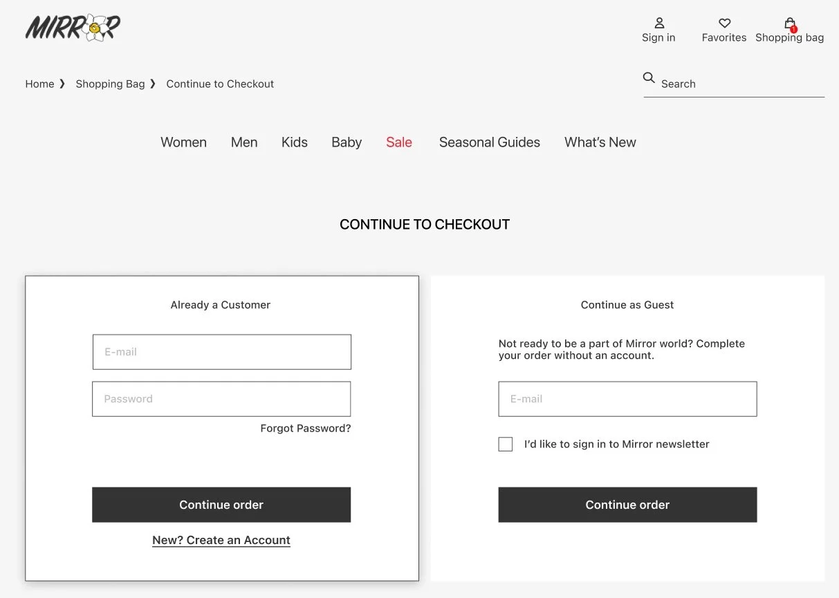
CHECKOUT / DESKTOP
ui kit
The Mirror UI kit is a comprehensive design guide that includes a cohesive color palette, logo, typography, and key interface elements like call-to-action buttons, product categories, and search functionality. It ensures visual consistency across the entire user experience, from product detail pages to checkout and search results, offering a seamless and intuitive shopping journey.

ITERATION & IMPLEMENTATION
Based on the usability test results, we revised the search results page to include clearer filters and refined the CTA buttons on the checkout page to improve conversion rates.
USABILITY TEST PLANNING
The usability test was designed to measure the effectiveness of navigation and the flow of completing a purchase, ensuring a smooth user experience throughout the site.
Objectives:
Test to see the usability of navigating through the Mirror website.
Test to see the functionality of searching for an item through the Mirror website.
Test to see the flow of purchasing an item from Mirror’s website.
Methodology: In-person & remote.
Participants: Between ages 14-65 who shop online.
Tasks, Errands: Homepage Screen, Search Results Screen, Checkout Page Screen.
Test Goals:
Able to see how successful the navigation on the homepage screen
Able to see how successful the functionality is on the search results screen.
Able to see how successful the flow for the checkout page is.
Able to see the information architecture, UI designs, and CTA buttons for the homepage, search results and checkout page.
Able to see the potential pain points for the homepage, search results, and the checkout page.
Able to see the current pain points for the homepage, search results, and checkout page.
Please use the link to see the full usability test planning for Mirror: https://docs.google.com/document/d/1G_ftgcnNyXraWXMSWZLYhX36EJ3UdfZu4KSiKgzZB_8/edit?usp=sharingHIGH FIDELITY PROTOTYPE
The high-fidelity prototype was created using Figma, bringing the responsive UI designs to life and allowing for interactive user testing.
Please use the link to see the high-fidelity prototype for the Mirror website: https://www.figma.com/proto/WnGuuLZ9dDHFeo06FI5sBX/MIRROR-PROTOTYPE?node-id=2-22&node-type=canvas&t=nSBrtxT9HSX9PMlJ-1&scaling=min-zoom&content-scaling=fixed&page-id=0%3A1&starting-point-node-id=2%3A22USABILITY TEST
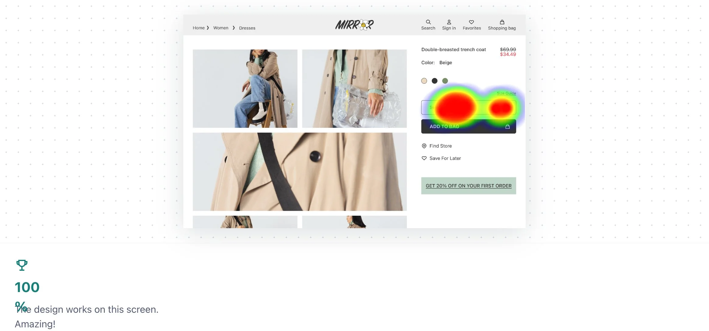
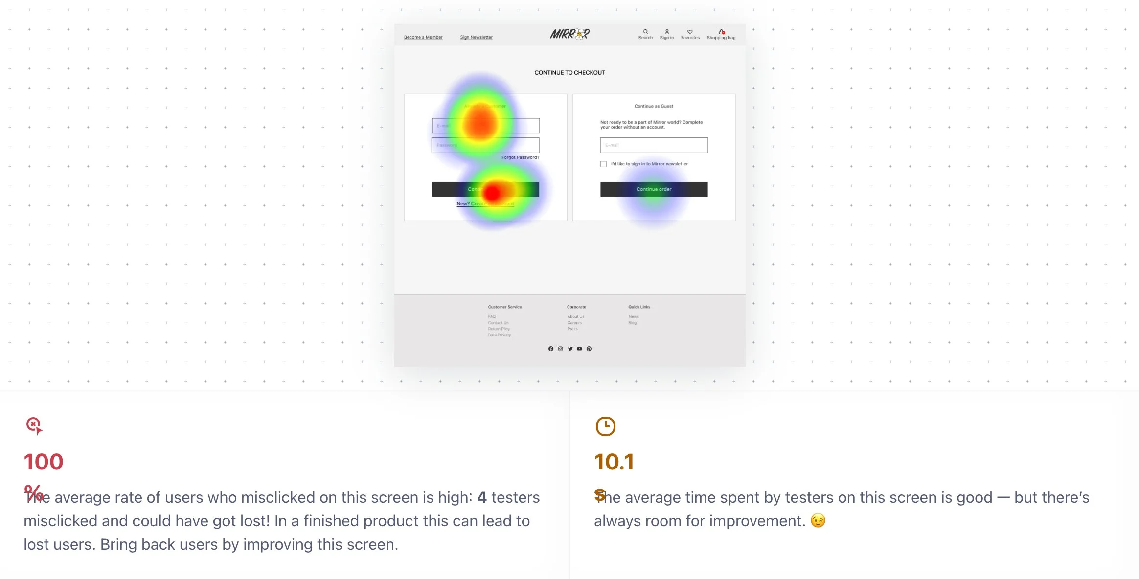
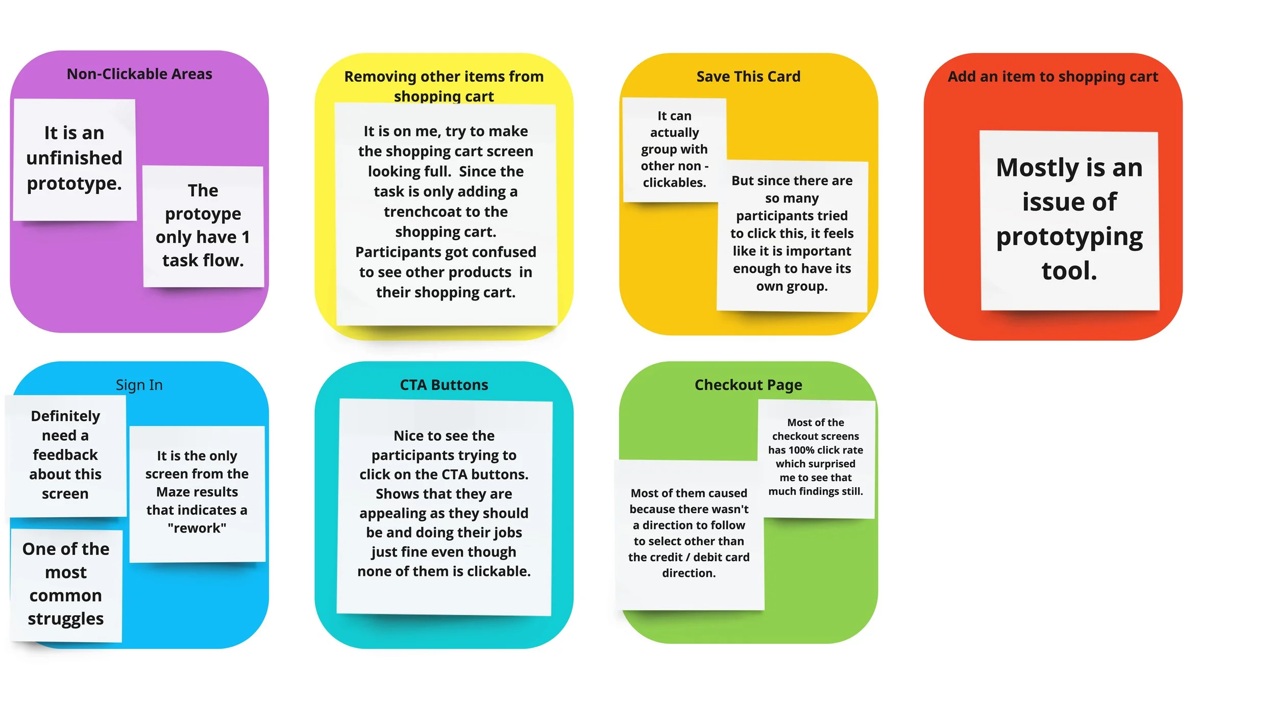
One task flow was tested both in-person and remotely using Maze. The two in-person sessions were moderated and utilized the “think aloud” method, while five remote participants completed the test unmoderated. Participants were asked to share any challenges they encountered during the task completion.
Please use the link to see the full report of usability testing: https://app.maze.co/report/New-maze-1/23g2nil7xvk1dn/introSCREENS WITH 100% SUCCESS
SCREENS TO RE-WORK
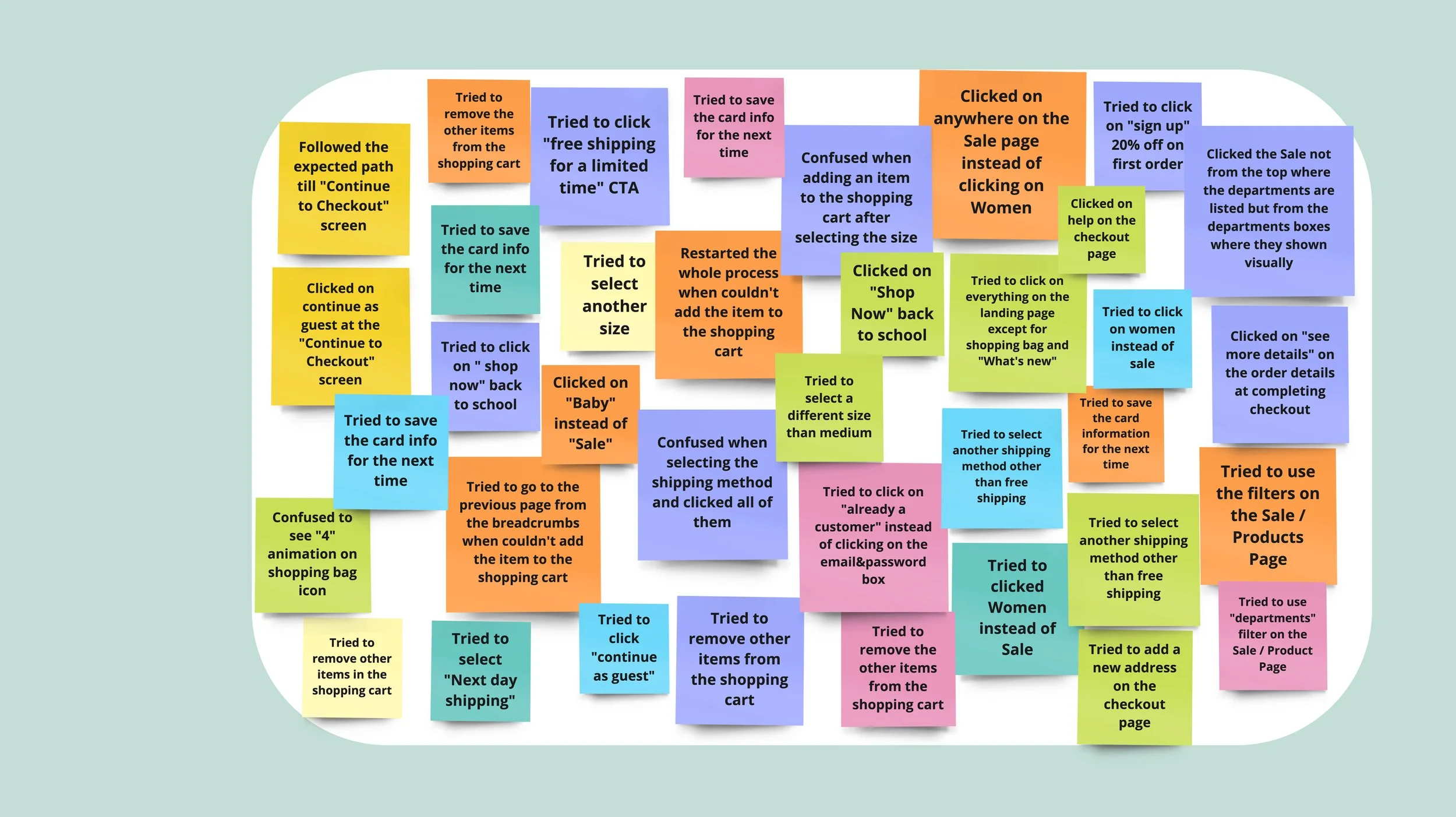
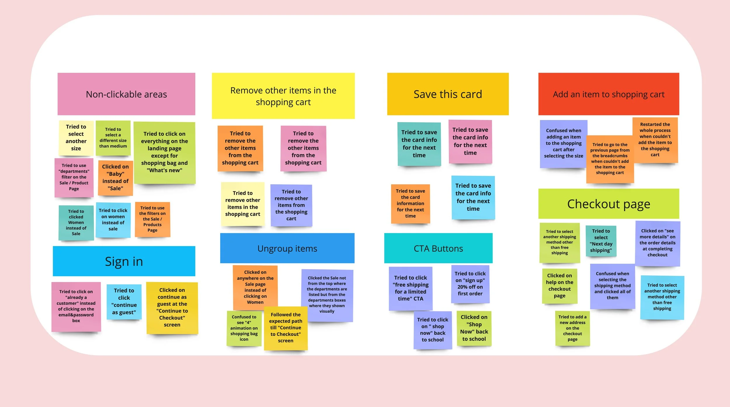
AFFINITY MAP
An affinity map was created in Miro to organize, prioritize, and rank insights from the user testing, helping to identify key patterns and areas for improvement.
PRIORITY REVISIONS ON HIGH-FIDELITY PROTOTYPE
Based on the usability test and affinity map findings, the following revisions have been prioritized to improve the high-fidelity prototype. First and foremost the sign-in issues were common among testers, indicating that the sign-in process requires refinement. This screen will be redesigned to improve clarity and ease of use, addressing the pain points observed during testing. Also, some work was done with the navigation menu breadcrumbs were added for easy navigation and the placement of the logo was changed for more white space.

PERSONAL REFLECTION
Working on the MIRROR project helped me improve my skills in user-centered design. I learned the importance of iterative testing and how small design changes can have a big impact on user experience.
NEXT STEPS
Future improvements could include enhancing product recommendations with AI and expanding the site’s accessibility features. Testing the mobile version more extensively is also a key next step.
KEY TAKEAWAYS


