Google Forms Case Study
Google was founded in 1998 as a search engine that used links to determine the importance of individual pages on the World Wide Web by computer scientists Larry Page and Sergey Brin. Their mission is to “organize the world’s information and make it universally accessible and useful”.
Project: Google requested to add a multi-language feature to Google Forms, focusing on creating a Minimum Viable Product (MVP). The objective is to improve accessibility in an increasingly multilingual world. With this new feature, form creators can design surveys or questionnaires in any language, while participants can select their preferred language to view and respond to the form. The priority is to deliver a seamless and well-functioning web experience, with a specific emphasis on optimizing the user flows and interfaces for this new capability.
Problem: While Google Forms is widely used, it lacks an intuitive way for users to switch between different languages. This created barriers for multilingual environments, particularly in educational environments where international participation is crucial.
Duration: 1 month
Role: End-to-end UX/UI designer
Tools: Figma, Adobe Illustrator, Maze, Miro, Canva, Google Forms, Google Slides

RESEARCH
Our research focused on understanding the needs of administrators and international students. We conducted one-on-one interviews and analyzed competitive products to identify pain points related to language accessibility.
1-ON-1 INTERVIEWS
CARES
Easy to use
Free
Effective results
Through 1-on-1 interviews with three participants, we gathered insights into user behavior, challenges, and priorities when using Google Forms and translation tools.
LOVES
Simple
Reliable
Time-saving
PAINS
User limits
Lack of Personalization
Lack of universality
survey INSIGHTS
We also conducted a survey with six participants to quantify user habits and pain points.
CARES
LOVES
PAINS
SECONDARY RESEARCH INSIGHTS
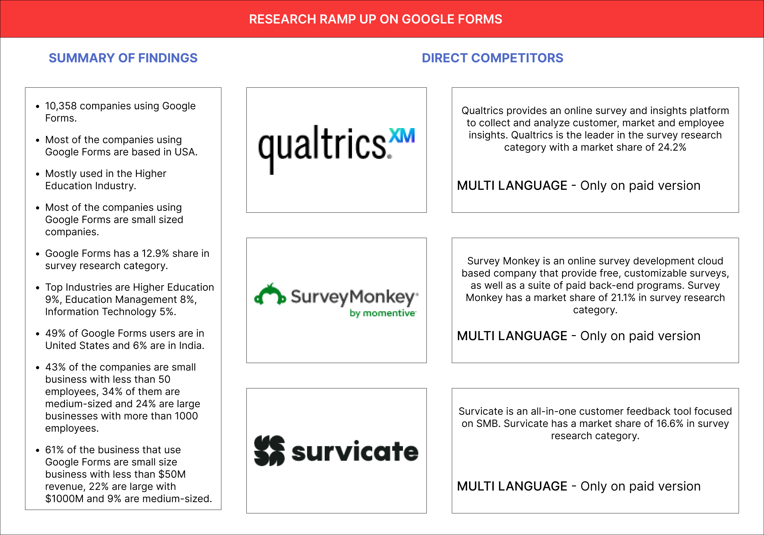
In parallel, secondary research was conducted to understand the market positioning of Google Forms and the market itself.
10,538 companies use Google Forms.
It is mostly used in the Higher Education industry.
Most of the companies that use Google Forms are small-sized companies.
43% of the companies are small businesses with less than 50 employees.
Google Forms has a 12.9% share in the survey research category.
49% of Google Forms users are in the United States.
competitive analyses
Competitors like Qualtrics and SurveyMonkey offer multi-language options but only in paid versions. This highlighted an opportunity to provide this feature for free in Google Forms
research findings
GOALS
Streamlined Communication
Enhanced Accessibility
Efficiency in Survey Creation
Through a combination of qualitative interviews, quantitative survey data, and market insights, we developed a comprehensive understanding of user goals and pain points, which guided the design and development of the multi-language feature for Google Forms.
pains
Language Barriers
Complexity in Setup
Limited Free Features

INFORMATION ARCHITECTURE
Vanessa is a 36-year-old university administrator working in San Diego. She works closely with international students and needs a translation tool to help bridge the communication gap. Her goals include easily communicating with her students and streamlining form processes.
“ I want to collaborate with international students without language barriers, using something simple and free to access.”
PERSONA
Vanessa is a university administrator in San Diego, CA. From a young age, she developed a passion for learning about new cultures and languages. Outgoing by nature, she enjoys making friends from all over the world. Growing up, she encountered the challenges of language barriers, a difficulty she continues to experience in her current role as she helps international students transition smoothly.
cares/loves
Communicate without language barriers
Simple and easy
Free
fears / frustrates
Cost Barrier
Tool Complexity
Time Consumption
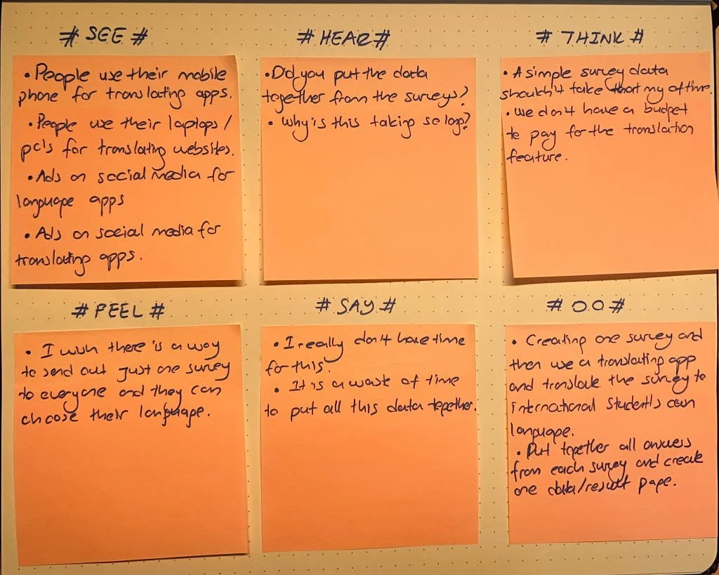
EMPATHY MAP
The empathy map is a tool that helps to gain deeper insights into the user's experiences and perceptions. We used an empathy map to dive deeper into Vanessa's needs and experiences.

INTERACTION DESIGN
In the Interaction Design phase of this case study, we focused on mapping out the user's experience and translating that into functional and intuitive interfaces. This phase is broken into two key parts: Task Flow and Wireframes.
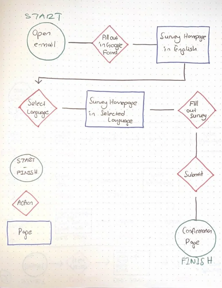
TASK FLOW
This visual representation maps out the steps users take when interacting with the Google Forms' new multi-language feature. From selecting their language to submitting their answers, the task flow ensures that the process is streamlined and logical, allowing for smooth navigation and minimal friction throughout the user journey.
WIREFRAMES
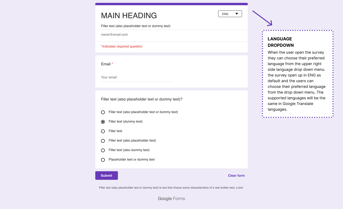
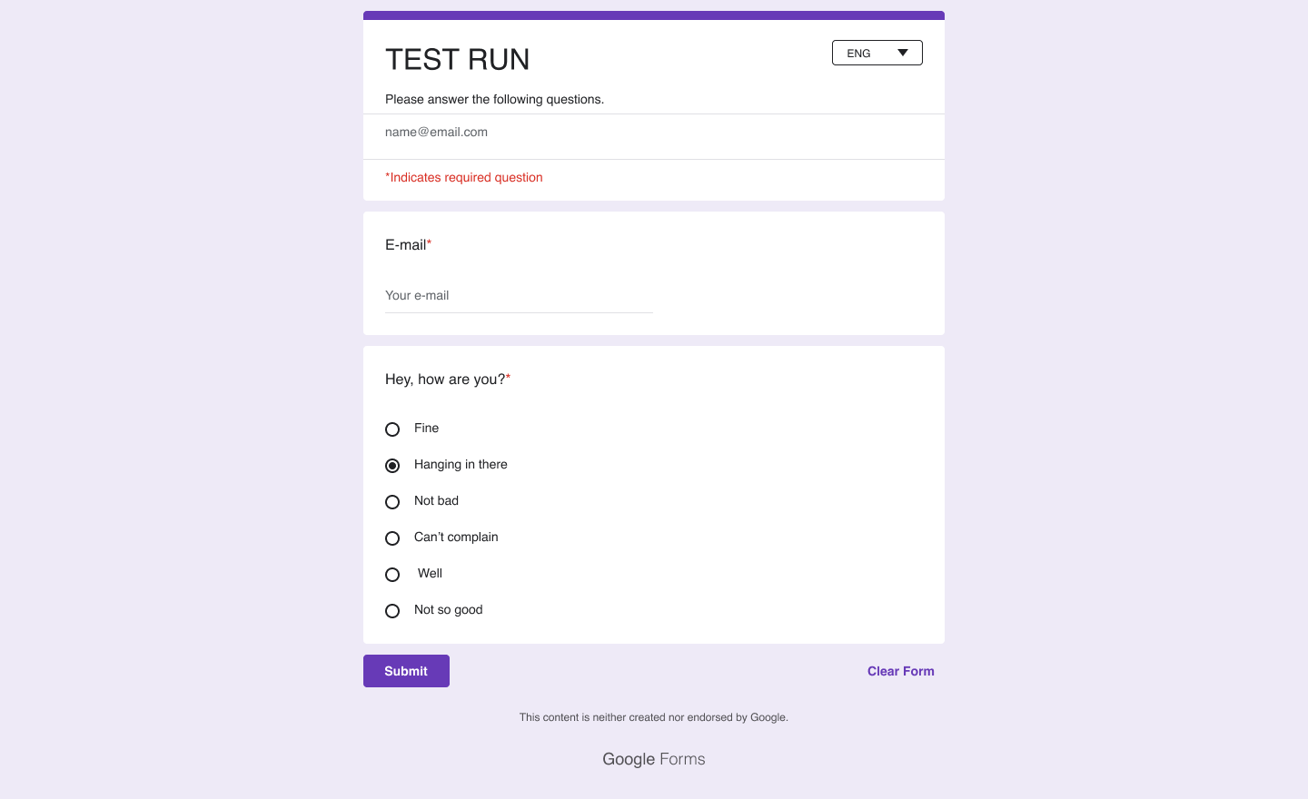
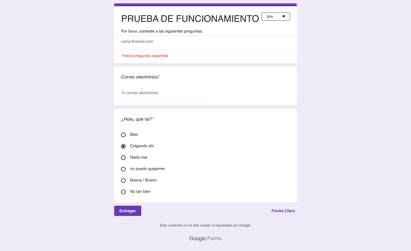
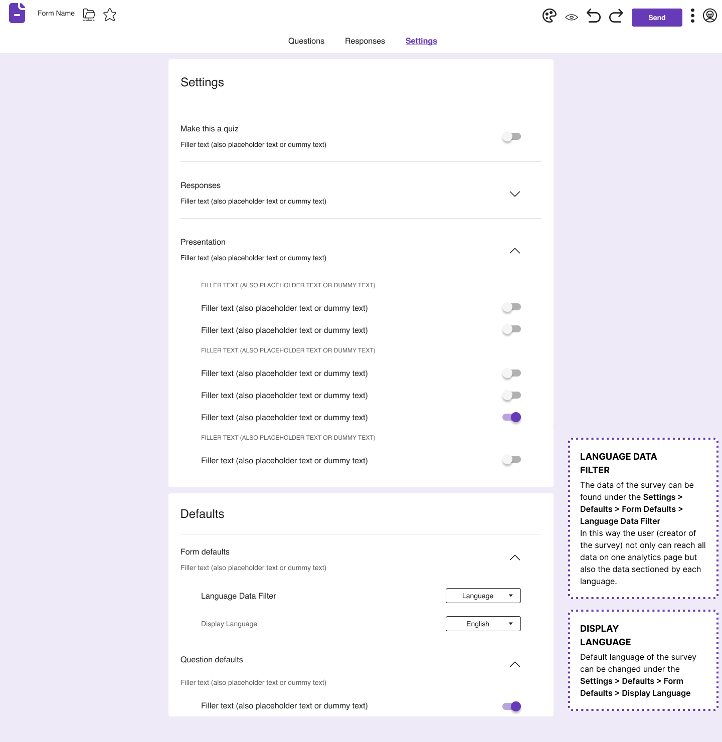
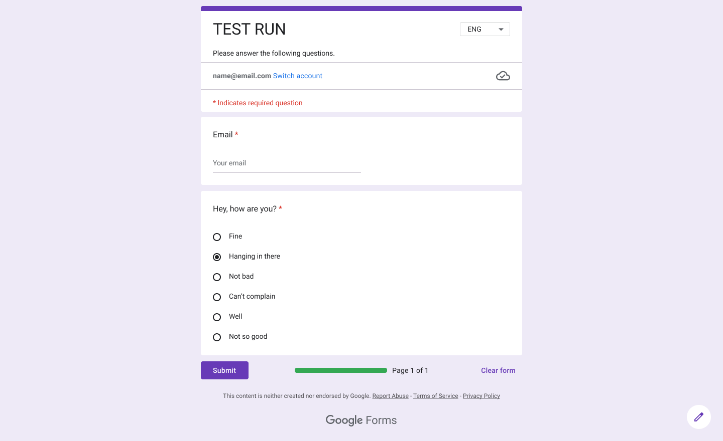
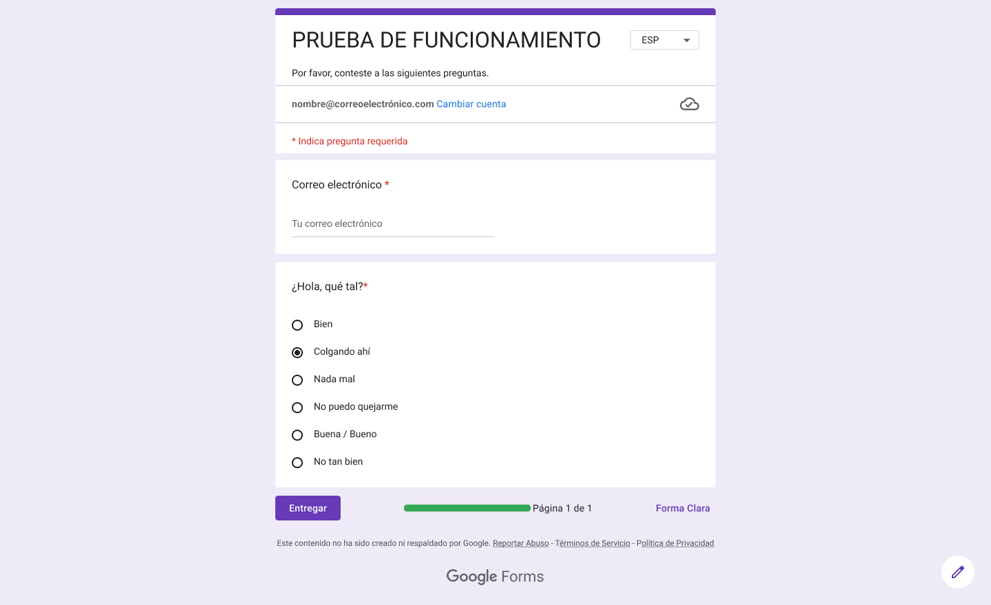
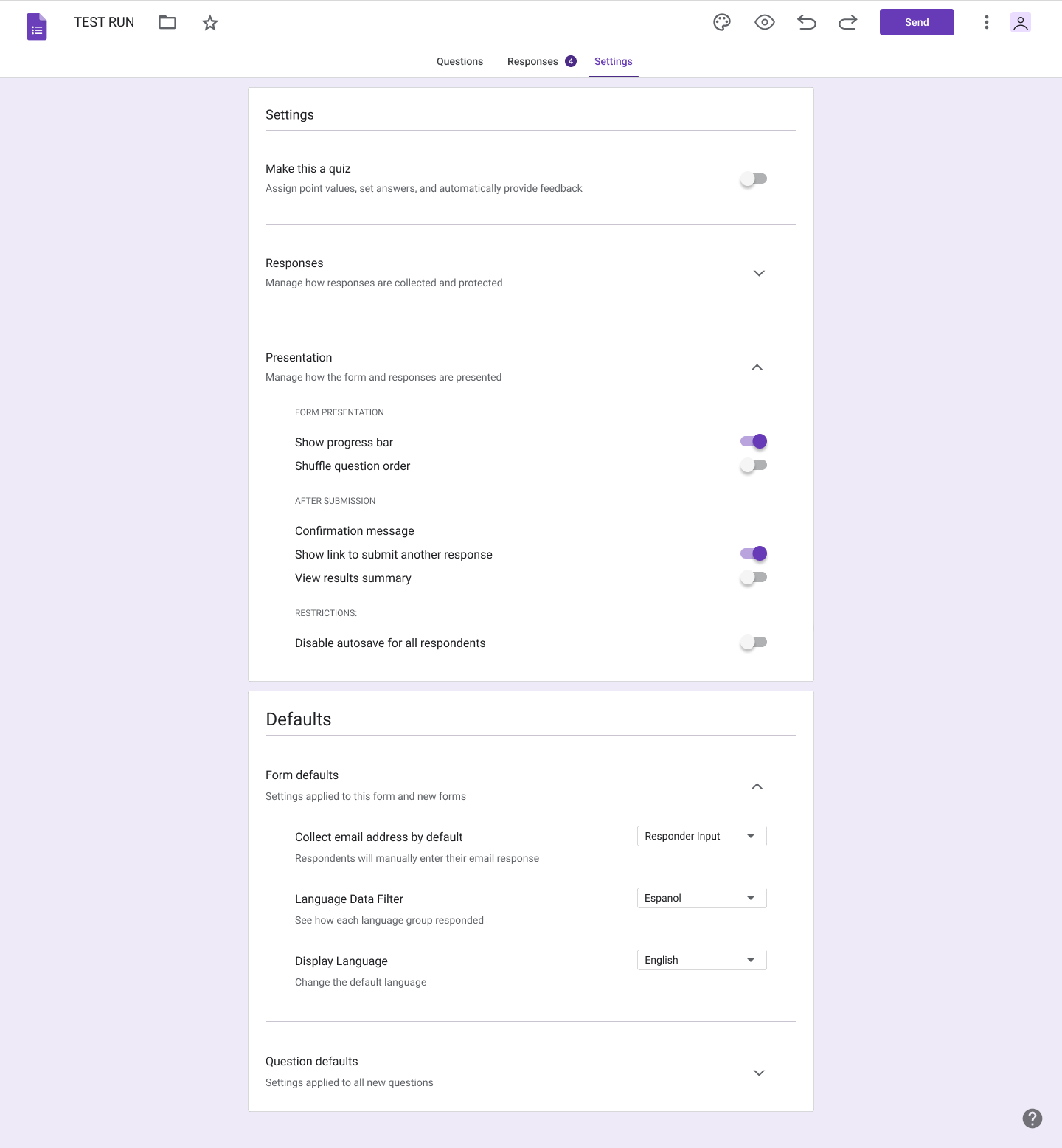
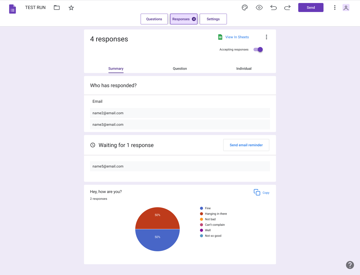
Wireframes bring the task flow to life by laying out the design of the user interface. For this project, we created low-fidelity wireframes to outline the basic structure and placement of elements such as language selection dropdowns, form fields, and submission buttons. These wireframes focus on usability and content hierarchy, ensuring that the multi-language feature is intuitive and easy to use before advancing to more detailed designs.
USER’S SCREEN LO-FI WIREFRAME
PARTICIPANT SCREEN DEFAULT / ENGLISH LO-FI WIREFRAME
PARTICIPANT SCREEN SPANISH LO-FI WIREFRAME
SETTINGS / DATA FOR MULTI-LANGUAGE SURVEY LO-FI WIREFRAME

UI DESIGN
The UI kit was designed to keep the colors and icons consistent with Google Forms' existing design system while introducing new elements such as language selectors and progress indicators for multi-language forms. We used a clean purple palette to maintain the brand's visual identity.
UI DESIGN
We incorporated the Google Forms visual language while introducing the new feature.

ITERATION & IMPLEMENTATION
In the Iteration & Implementation phase, we refined the multi-language feature for Google Forms based on user feedback. We improved the language selection and streamlined the form layout through iterative testing. After validating these enhancements, the feature was successfully implemented, ensuring a seamless, accessible experience for users across multiple languages.
USABILITY TEST
For the usability test, we used Maze to conduct remote testing with 5 participants. They completed 3 missions, allowing us to observe their interactions with the multi-language feature, gather insights on the user experience, and identify areas for further refinement.
Please use the link to see the full usability report: https://app.maze.co/report/Google-Forms-Usability-Test/dv8s7lzfyte02/introSCREENS WITH 100% SUCCESS
SCREENS TO REWORK
HIGH FIDELITY WIREFRAMES
The high-fidelity wireframes brought the multi-language feature to life, showing the final design for the language drop-down, radio buttons for selecting questions, and the progress bar. The interface remained familiar to regular users of Google Forms while incorporating new accessibility features.
USER’S SCREEN HI-FI WIREFRAME
SETTINGS / DATA FOR MULTI-LANGUAGE SURVEY HI-FI WIREFRAME
PARTICIPANT SCREEN DEFAULT / ENGLISH HI-FI WIREFRAME
PARTICIPANT SCREEN SPANISH HI-FI WIREFRAME
PROTOTYPE
We created a clickable prototype in Figma to showcase the complete user flow, from selecting a language to submitting the form, filtering data by language, and viewing results by language. This prototype enabled us to test how smoothly users could switch languages and retrieve the necessary survey data, while ensuring the form's content adapted seamlessly.
REVISIONS
Based on the usability test feedback, we prioritized revisions to improve the high-fidelity prototype. With a 60% misclick rate, users often clicked the wrong "Responses" tab, highlighting the need for reworking this screen. We emphasized the top "Responses" tab to guide users more clearly. These revisions focused on enhancing the navigation flow and addressing key pain points, ensuring a smoother, more intuitive user experience.
before
before
after
after

PERSONAL REFLECTION
Reflecting on my work with the Google Forms multi-language feature, I have learned the importance of balancing user needs with technical constraints. Working through iterative design and usability testing taught me the value of feedback in shaping a more user-friendly product. I gained deeper insights into managing design revisions based on real-world usage, and I feel more confident in my ability to design for a diverse, global user base.
NEXT STEPS
Moving forward, we are excited to collaborate with Google to make this feature a permanent addition to Google Forms.
Test the feature with a larger, more diverse international user base to ensure a seamless experience across multiple regions and languages.
Continuously collect feedback post-launch to identify areas for improvement and enhance the user experience.
Analyze how frequently users utilize the multi-language feature and identify patterns or challenges in different regions.
Explore adding more advanced translation features, such as auto-translation for responses and multilingual data analysis.
KEY TAKEAWAYS


