American Airlines Case Study
American Airlines is a 95-year-old company with significant milestones in aviation history. The project focused on delivering a responsive website, specifically optimizing the Searching, Booking, and Check-in flows with an emphasis on the mobile web experience.
Project: Designing a responsive website for American Airlines focusing on Search, Booking, and Checking-in flows and UIs with an emphasis on the mobile web experience.
Problem: American Airlines sought to enhance the mobile web experience for its users, focusing on the core functions of Searching, Booking, and Checking in. The goal was to streamline these processes while addressing common user pain points.
Duration: 3 months
Role: End-to-end UX/UI designer
Tools: Figma, Adobe Illustrator, Maze, Miro, Canva, Google Forms, Google Slides

RESEARCH
We conducted 1-on-1 interviews, surveys, and secondary research to better understand user needs. We focused on understanding the goals and pain points of American Airlines’ potential and existing customers across different types of travelers - business, leisure, international, and domestic.
1-ON-1 INTERVIEWS
CARES
Prefers user-friendly booking interfaces
Values clear and easy-to-access information regarding flight details
Wants reliable customer service that responds quickly.
To gather qualitative insights about user behavior, motivations, and pain points.
LOVES
Enjoys personalized travel recommendations
Appreciates loyalty rewards and point programs
Loves being able to see price comparisons for multiple airlines
PAINS
Frustrated with hidden fees during booking
Dislikes the slow website loading times
Struggles with too many steps in the checkout process
survey INSIGHTS
To gather quantitative data from users to back up interview findings.
CARES
LOVES
PAINS
SECONDARY RESEARCH INSIGHTS
To identify trends and patterns in the airline industry to understand competitive positioning.
Passenger Growth: The U.S. market is expected to accommodate 1.3 billion passengers by 2037.
Millennial Travelers: By 2050, app. 2.4 billion millennial passengers will be traveling by air, reflecting a growing demographic for airlines to cater to.
Market Share: In 2021, American Airlines held a 19.5% share of the U.S. domestic market, making it one of the top three competitors alongside Southwest and Delta.
Brand Value: In 2022, American Airlines was one of the most valuable airlines globally, with a brand value surpassing $5 billion, placing it just behind Delta and United Airlines.
Customer Satisfaction: American Airlines earned a 77 out of 100 in the 2021 American Customer Satisfaction Index (ACSI), indicating a generally positive reception of its services.
COMPETITIVE ANALYSES INSIGHTS
We analyzed the mobile experiences of Delta Airlines and United Airlines to identify industry standards and opportunities for differentiation. Key features like “My Trip”, flexible date calenders, and best price displays informed the design pricess.
research findings
GOALS
Efficient Booking Process
Tranparent Pricing
Flexible Options
Through extensive interviews, surveys and secondary research, several key users goals and pain points were identified. These insights guided the design and user experience strategy for the American Airlines project.
pains
Hidden Fees
Complicated Navigation
Long Load Times

INFORMATION ARCHITECTURE
meet Melissa, a 40-year-old mother who frequently flies internationally with her daughter. melissa values an easy, cost-effective searching and booking experience. her pain points include the overwhelming number of options with insufficient detail and unexpected price increases.
“Easy and cost-effective searching & booking are the first steps to a happy vacation.”
PERSONA
Melissa is a 40-year-old mother of an 8-year-old daughter. She works a 9-to-5 job as an accountant and lives in a modern apartment with her daughter. Together, they enjoy playing imaginative games where they pretend to travel the world. Melissa typically flies with her daughter during the holidays, with most of their trips being international.
cares/loves
To find good deals
A seamless searching and booking
Finding travel packages
fears / frustrates
Overwhelming amount of options with too little information
Too many factors affecting her choice (price, duration, etc…)
Ending up much higher prices that she anticipated while booking
EMPATHY MAP
For the American Airlines case study, we utilized the empathy map tool to understand Melissa’s experiences, needs, and frustrations during her travel planning and booking process. The empathy map helps highlight her emotions, thoughts, actions, and goals, which in turn guides the design decisions.
FEATURE ROAD MAP
The feature roadmap in this case study was designed to help organize the essential elements of the American Airlines user experience. By categorizing features based on priority (Must-Have, Nice to Have, Surprising, Delightful, Can Come Later), it was possible to align product development with user needs, competitive research, and technology feasibility.
This structured approach allowed for clear visualization of both immediate and long-term goals, ensuring that user pain points and desires were addressed efficiently. for example, features such as Login, Search Bar, and Check-in were identified as crucial, while options like Personal Travel Recommendations and Cruise Packages were delightful enhancements for future iterations.

INTERACTION DESIGN
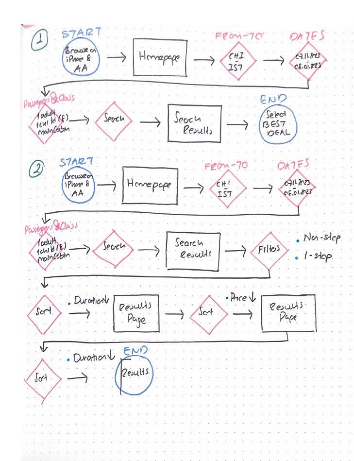
User flows and task flows were created to streamline the customer’s journey from flight search to check-in. They played a critical role in shaping the user experience and ensuring that the platform addressed user needs at every stage of the travel journey.
TASK FLOW
The task flow was utilized to map out critical tasks such as booking a flight, checking in, and accessing flight status updates. Each task flow visualizes how a user would interact with the interface from start to finish, ensuring a seamless and intuitive process. By analyzing user actions, we identified opportunities for reducing friction in key areas such as seat selection and payment submission.
task flow for searching
task flow for booking
USER FLOWS
The user flows helped us identify and outline multiple access points to a given task. For instance, a user might start a flight search from the homepage, a promotional email, or even a mobile notification. By understanding these diverse entry points, we ensured that the system could accommodate various user behaviors and preferences while maintaining consistency and clarity in navigation.
user flow for searching
user flow for booking
WIREFRAMES
The wireframes represent the visual blueprint for key screens within the American Airlines platform, focusing on functionality and layout without the distraction of design elements. In this case study, mid-fidelity wireframes were created for the booking process, including the homepage, search results, and passenger information screens. These wireframes helped establish the information hierarchy and ensured that essential features like search, booking, and check-in were easily accessible and user-friendly.
BOOKING LO-FI WIREFRAME
TRIP SUMMARY LO-FI WIREFRAME
SEARCH RESULTS LO-FI WIREFRAME
SEAT SELECTION LO-FI WIREFRAME
CABIN SELECTION LO-FI WIREFRAME
REVIEW & PAY LO-FI WIREFRAME
RESPONSIVE WIREFRAMES
Two different layouts were designed for the American Airlines searching, Cabin Selection, and Passenger Info for web, and mobile devices to ensure a seamless user experience across all platforms.
BOOKING LO-FI WIREFRAME / DESKTOP
CABIN SELECTION LO-FI WIREFRAME / DESKTOP
PASSENGER INFO LO-FI WIREFRAME / DESKTOP

UI DESIGN
high-fidelity ui designs were created for both desktop and mobile, incorporating American airlines’ brand identity and emphasizing user-friendly navigation for searching, booking, and check-in.
UI KIT
This UI kit is designed to ensure a cohesive and streamlined booking experience for American Airlines. It includes a consistent color palette, icon set, and logo, with a clean, user-friendly design across key components like booking, search results, cabin selection, and payment. The kit maintains brand consistency while simplifying the user journey, ensuring clarity and ease of use at every step.
RESPONSIVE UI DESIGN
The responsive UI design for the American Airlines project demonstrates how the key booking, search results, cabin selection, and payment processes are presented across different screen sizes. The design ensures a consistent and user-friendly experience on both desktop and mobile platforms. The mobile design focuses on ease of use with simple, prominent buttons, streamlined navigation, and easy-to-read text, facilitating smooth interactions, such as booking flights or checking in, regardless of the device the user is on. This design also adapts features like search filtering and payment flow to be intuitive on smaller screens without sacrificing functionality.
BOOKING HI-FI WIREFRAME
SEARCH RESULTS HI-FI WIREFRAME
TRIP SUMMARY HI-FI WIREFRAME
CABIN SELECTION HI-FI WIREFRAME
PASSENGERS INFO HI-FI WIREFRAME
BOOKING HI-FI WIREFRAME / DESKTOP
CABIN SELECTION HI-FI WIREFRAME / DESKTOP
PASSENGER INFO HI-FI WIREFRAME / DESKTOP

ITERATION & IMPLEMENTATION
a high-fidelity prototype was created using Figma, stimulating the entire customer journey from search to check-in. this allowed for early testing and iteration.
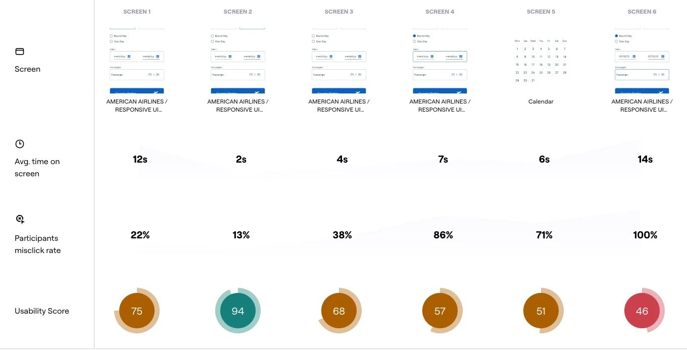
USAbility test
The prototype was tested with 5 participants using the “think aloud” method, both in-person and remotely through Maze. Key insights included struggles with the “Add Passenger” feature, leading to a prioritized revision.
Please use the link to see the full usability report: https://app.maze.co/report/American-Airlines-Booking/ykfhtlnordt72/introSCREENS USABILITY BREAKDOWN
SCREEN TO RE-WORK
HIGH-FIDELITY PROTOTYPE
The high-fidelity prototype was created using Figma, bringing the responsive UI designs to life and allowing for interactive user testing.
Please use the link to see the high-fidelity prototype for American Airlines: https://www.figma.com/proto/5CacwGPnaejmHplDB48IQn/Untitled?page-id=0%3A1&node-id=1-41&node-type=frame&viewport=548%2C311%2C0.52&t=36PqgOJIp3SbR741-1&scaling=contain&content-scaling=fixed&starting-point-node-id=1%3A2407PRIORITY REVISIONS ON HIGH-FIDELITY PROTOTYPE
After the usability test, revisions were made to emphasize the “Add Passenger” functionality. This revision was crucial to ensuring a smoother checkout process, reducing friction during booking.
BEFORE & AFTER REVISION

PERSONAL REFLECTION
this project highlighted the importance of mobile-first design in the travel industry. iterative usability testing helped uncover crucial usability issues early in the design process, allowing for meaningful improvements before the final implementation.
NEXT STEPS
Iterate Based on User Feedback: After the initial usability testing, there are still opportunities to refine the UI further. Continuing to collect feedback from a wider audience, especially on mobile-specific interactions, to ensure seamless use across all platforms should be a priority next step.
A/B Testing: Implementing A/B testing on key features such as the search functionality, booking flow, and cabin selection to see which design variations lead to higher conversions and better user engagement.
Advanced Prototyping: Develop higher-fidelity prototypes, including more detailed micro-interactions and real-time data integration, to simulate the end-to-end booking process.
Launching a Pilot Program: Before the full rollout, launch a pilot program with select users to gather in-depth behavioral insights and further validate the design.
Focus on Accessibility: Ensure the design meets all accessibility guidelines, such as optimizing for screen readers, ensuring color contrast, and making the platform easy to use for people with disabilities.
KEY TAKEAWAYS


